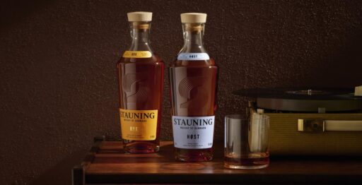
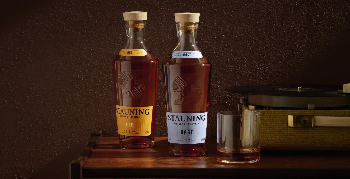
Danish distillery Stauning is marking its 20th anniversary with the unveiling of a new visual identity, beginning with updated bottlings for its RYE and Høst whiskies. The refreshed look will be gradually introduced across the full Stauning range by 2026.
Rooted in the principles of Danish design simplicity, the new packaging reflects Stauning’s core philosophy of “from grain to glass.” The new bottle features clean, architectural lines, while the updated brand symbol tells the story of the distillery’s nine founders through nine distinct lines and a central grain motif.
Alex Munch, co-founder of Stauning Whisky, commented:
“This is an important milestone for Stauning – a distillery that began 20 years ago as a wild idea among friends and has grown into one of the world’s most respected New World whisky producers.
“Our new look honours traditional whisky cues while representing our future – thoughtful, design-driven, and unmistakably Danish.”
Scott Milne, Marketing Director at Stauning, added:
“Our aim was to craft a brand identity that captures the spirit of wonder and speaks to a wide audience: considered, full of character, and deeply Danish.
“In a crowded whisky market, standing out is essential. This new look celebrates Danish taste and invites a broader community – from whisky enthusiasts to curious newcomers – to see whisky through a new lens.”
The redesign aligns with Stauning’s continuing mission to blend tradition with innovation, showcasing the unique character of Denmark’s whisky craft to the world.