
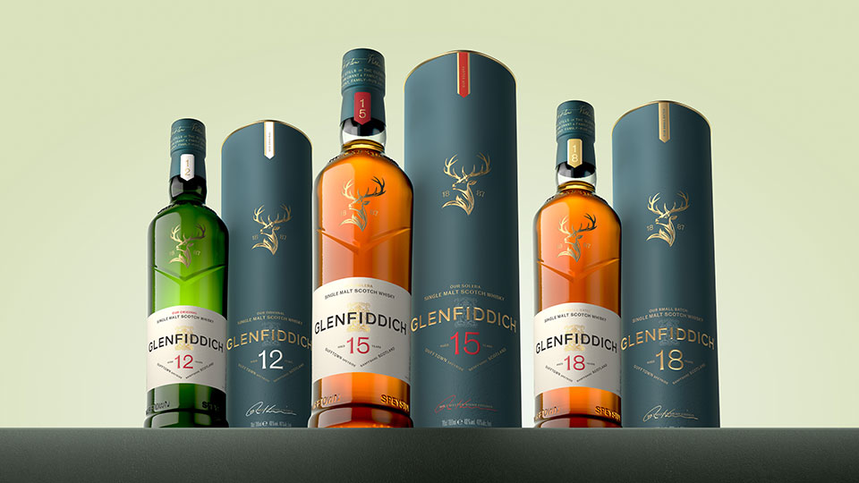
Glenfiddich has unveiled a new packaging redesign, drawing inspiration from its iconic releases of the 1960s, the era when the brand helped establish Single Malt Scotch Whisky as a global spirits category.
The refreshed look features a reimagined stag emblem, which has appeared on Glenfiddich bottles since the 1960s. The stag was originally inspired by Sir Edwin Landseer’s 1851 painting The Monarch of the Glen, a symbol long associated with the brand’s heritage and identity.
The Glenfiddich wordmark has been updated to a modern sans-serif typography, blending contemporary clarity with a tribute to classic British type design and the branding that first appeared on bottles in the 1960s. Additionally, the Grant Family Crest has been refined and is now embossed within the new packaging, reinforcing the brand’s family-owned legacy.
The redesigned packaging will begin rolling out globally from April 2026.